So you've spent weeks choosing the perfect tile for your bathroom or kitchen reno. The colour's right, the size feels good, and the price is finally within budget. Job done, right?
Not quite. There's one decision left that most homeowners don't think twice about until it's too late: which way the tiles are going to run.
It may sound like a minor detail but it isn't. Tile direction quietly shapes how large a room feels, how the light behaves, even how much time you'll spend cleaning grout lines. The good news is that once you understand the logic behind it, it becomes one of the easier calls you'll make in the whole reno.
Before getting into the specifics, it helps to understand what grout lines actually do to a space. The eye naturally follows lines. When you walk into a room, your gaze tracks along the longest visible edges, and grout lines are exactly that: thin, repeating lines that point your attention in a direction.
Knowing this is important because it means you can use tile direction to visually reshape a room without touching a single wall.
Running tiles horizontally (landscape) makes a room feel wider. The eye sweeps left to right, and the space reads as broader than it actually is. This is a classic move in narrow en suites or galley-style bathrooms where the floor plan is tight.
Running tiles vertically (portrait) draws the eye up and along the length of the room, making it feel taller and longer. This works beautifully in bathrooms with lower ceilings, or in long, narrow hallways where you want the space to feel taller or deeper.
Diagonal layouts are the wildcard. Tiles laid at 45 degrees create visual energy and movement, and they have a handy trick up their sleeve: they tend to make small rooms feel bigger by expanding the perceived floor area. The trade-off is that diagonal laying requires more cuts, more waste, and a bit more skill from your tiler, so expect it to add to both the material and labour cost.
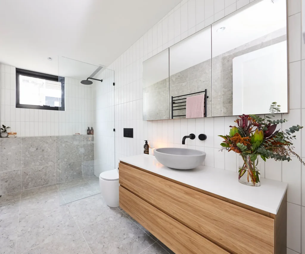
Image: Beaumont Tiles.
Here's something that catches a lot of homeowners off guard: tile direction affects how a surface reflects light, and that directly impacts how clean your bathroom or kitchen looks day-to-day.
Grout lines cast tiny shadows. When light travels across a surface, it catches anything perpendicular to it. So if your main light source (whether that's a north-facing window, a skylight, or your overhead downlights) travels in one direction, grout lines running across that light will pick up every scuff, dust particle, and water splash.
Grout lines running parallel to the light source sit in that light rather than across it, making the surface look cleaner and more seamless. In a wet area like a shower or above a splashback, this isn't just an aesthetic choice. It's a practical one.
A good tiler will think about this for you, but it's worth asking the question upfront: where does the light come from, and are we working with it or against it?
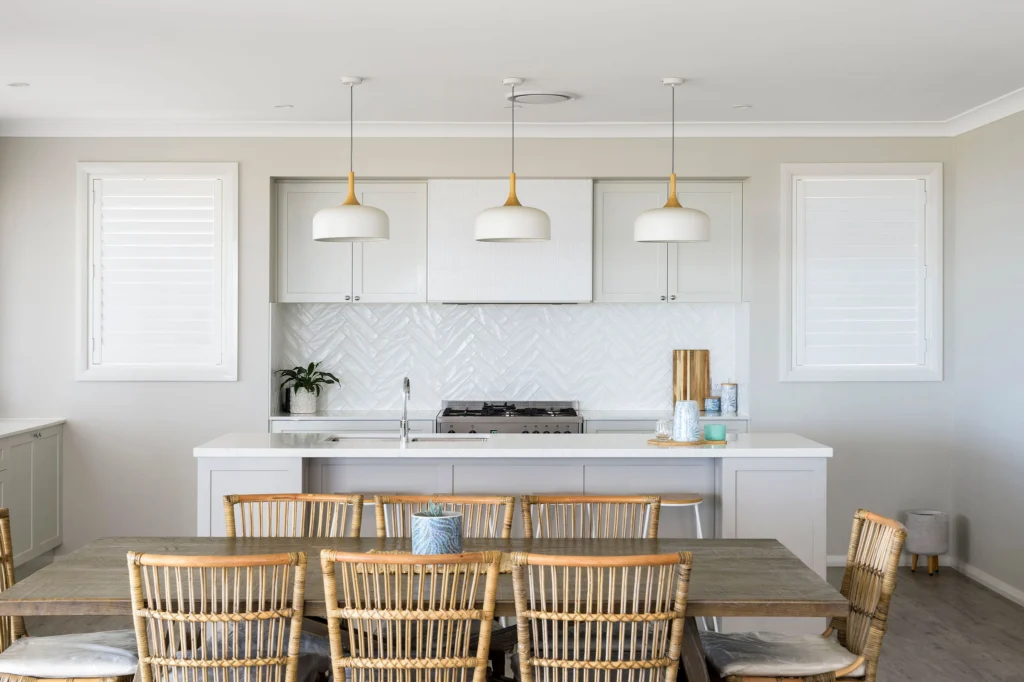
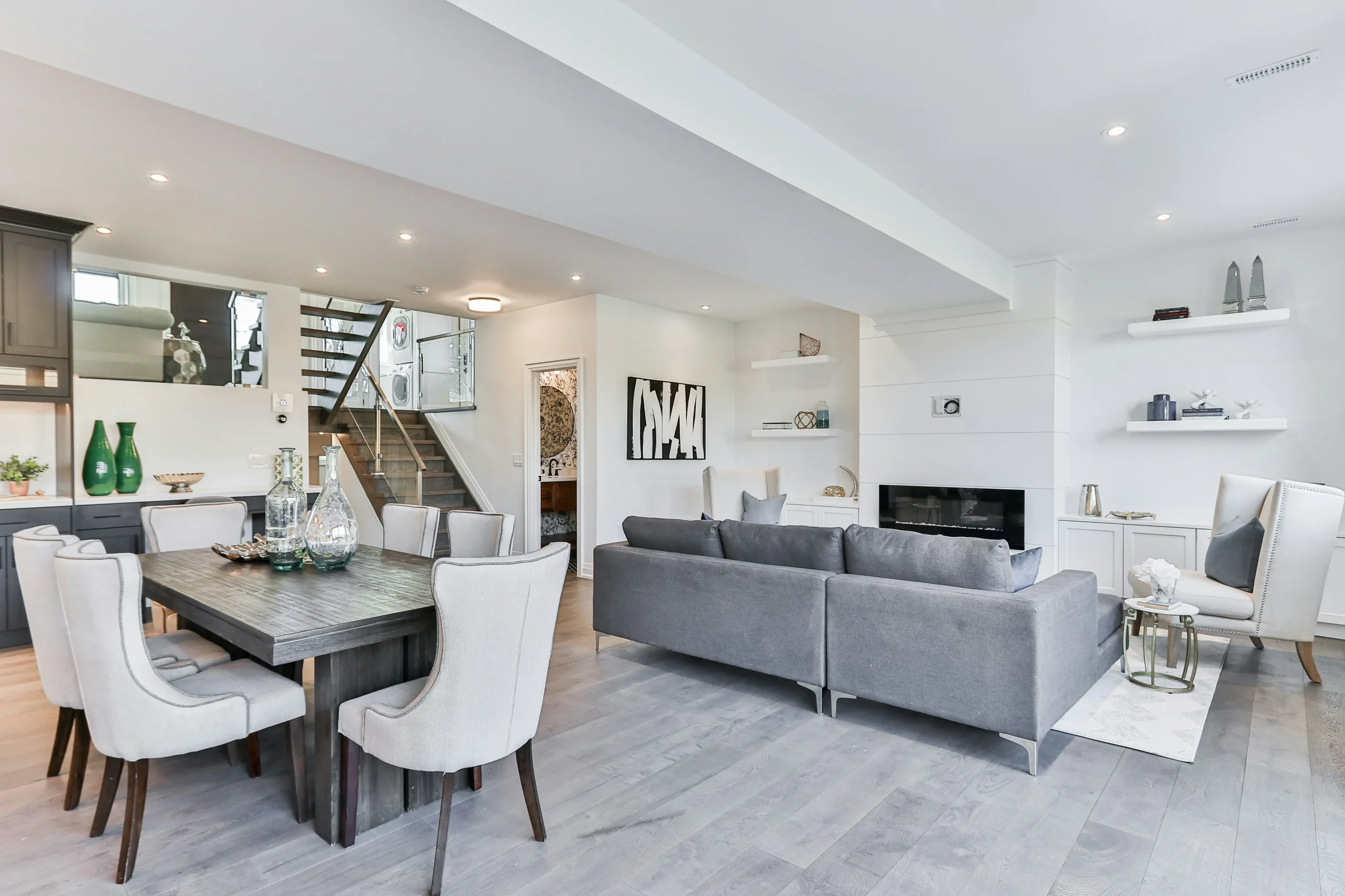
Image: Central Coast builder, Sense Homes.
There's no single right answer that works everywhere, but there are some reliable rules of thumb for common Australian home layouts.
In a narrow bathroom (think ensuites and apartment bathrooms), laying floor tiles lengthways along the longest wall creates a visual stretch that makes the room feel less like a corridor. If you pair that with subway tiles running horizontally on the walls, the whole space opens up considerably without a single structural change.
In a roughly square bathroom or kitchen, you have more freedom. Any direction works without fighting the proportions, so this is where you can lean into pattern and personal style. Herringbone layouts shine in square spaces because they add visual interest without distorting the shape of the room.
In a large open kitchen, the tile direction should generally follow the main traffic flow or point towards a focal point: the island bench, range hood, or feature window. Tiles running toward something give the space a sense of destination. Tiles running across the traffic flow can feel slightly awkward, like they're working against the natural movement through the room.
In a laundry or small WC, diagonal is often a better choice than it might seem at first glance. Because the room is already small, a 45-degree layout tricks the eye into reading more floor space, and the space ends up feeling like a considered design decision rather than an afterthought.
Tile direction is closely tied to the laying pattern, and the two decisions are really made together.
A straight grid pattern is classic and clean. It works with everything and never dates, but it does demand a bit more precision because any imperfection in the wall or floor is more obvious when all the lines are perfectly parallel.
An offset or brick bond pattern (where each row shifts by half a tile) is the most popular choice in Australian bathrooms right now for good reason. It softens the regularity of the grid, hides minor inconsistencies in walls and floors, and suits both rectangular subway tiles and larger format tiles equally well.
Herringbone is the premium option. It takes more skill, more time, and more tiles - and as we mentioned, around 15% extra is needed for cuts and waste. However, it creates a visual richness that stands on its own even in a simple white-and-grey palette.
Stacked vertical patterns have come back in a big way, especially for wall tiles in showers. Long rectangular tiles stacked directly on top of each other rather than offset creates a very contemporary look that suits minimalist and Japandi-style bathrooms particularly well.
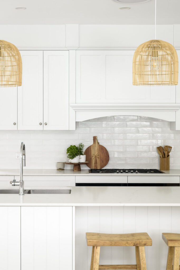
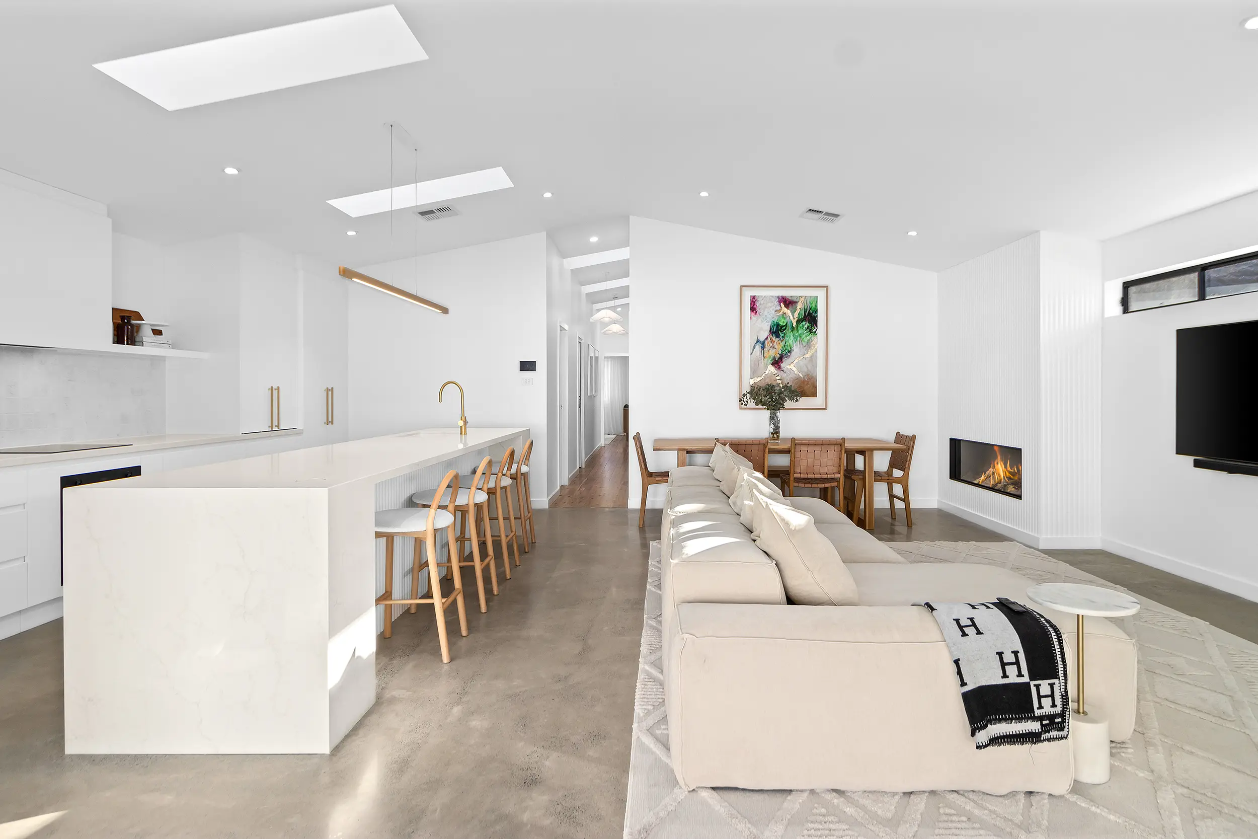
Image: Newcastle builder, Bull Building
Tile direction and grout width are a package deal. Wider grout lines (2mm or more) create a more defined grid that emphasises the pattern. Narrow grout lines push the tiles together and make the surface read as more continuous.
If you want the tile direction to be obvious and graphic, go slightly wider with the grout. If you want the surface to feel seamless and the pattern to be subtle, keep grout lines tight and choose a grout colour that's close to the tile.
One thing that catches people out: very large format tiles (600mm x 600mm and above) often need a minimum grout width for structural reasons, so always confirm with your tiler before locking in a look.
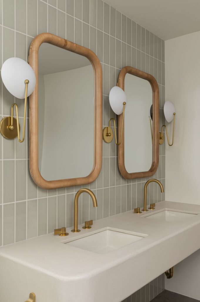
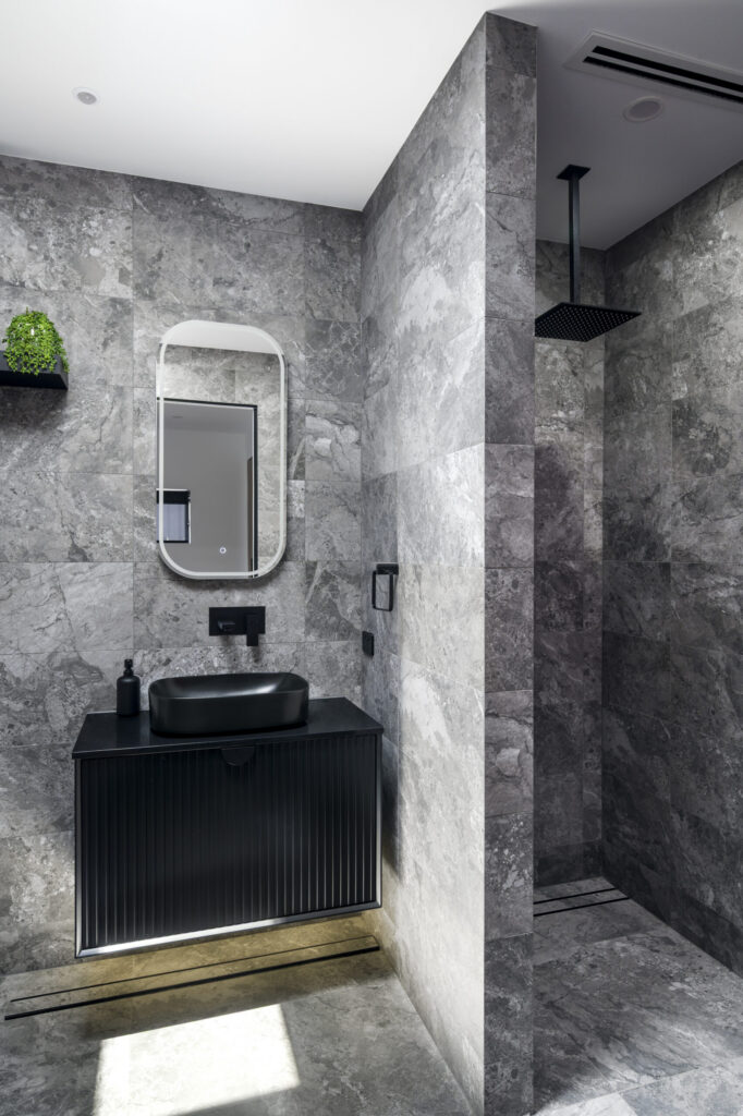
In bathrooms especially, the feature wall is its own separate conversation. If you're running a pattern or a different tile entirely on one wall, the direction of that tile doesn't need to match the floor. In fact, running it in a contrasting direction is often exactly what gives the wall its definition.
The key is to make it look deliberate. A feature wall with vertical tiles paired with a horizontal floor reads as an intentional design choice. But if the same combination isn't planned carefully, it can look like two unrelated decisions that just ended up in the same room.
The most important time to think about tile direction is before your tiler arrives on site, not during. Changes mid-job are expensive and disruptive, and once the tiles are down, it’s difficult to undo them.
A few things worth doing in the lead-up:
Lay some tiles out dry on the floor or lean them against the wall and take a photo. Then rotate them 90 degrees and take another. The difference is often more obvious in a photo than in person.
Ask your tiler to show you a sample layout with chalk lines or spacers before any adhesive goes down. Any decent tradie will do this as a matter of course, but it's worth asking explicitly.
Think about where you'll be standing or sitting in the room most often. The best vantage point for assessing tile direction is from the door or from your usual position in the space, not from directly above.
And finally, check whether your chosen tile is directional. Some tiles, particularly wood-look planks, stone-look tiles, and anything with a textured surface, have a grain or pattern that creates a different effect depending on orientation. Run them one way and they look like timber boards. Run them the other way and the effect breaks down entirely.
Tile direction is one of those renovation decisions that can cost nothing extra to get right and can be surprisingly expensive to get wrong. It shapes the way your room looks and feels every single day, affects how easy it is to keep clean, and either reinforces or works against the proportions of your space.
The good news is that the logic behind it is straightforward once you know what to look for. Match the direction to the shape of the room, think about where your light comes from, consider the pattern in context, and make the decision before you're standing on site with a tiler waiting for an answer.
Get this one right and the rest of the room tends to fall into place.